Donation Campaign
- Design project
Overview
Goal: Spread environmental awareness on the donation page.
Process
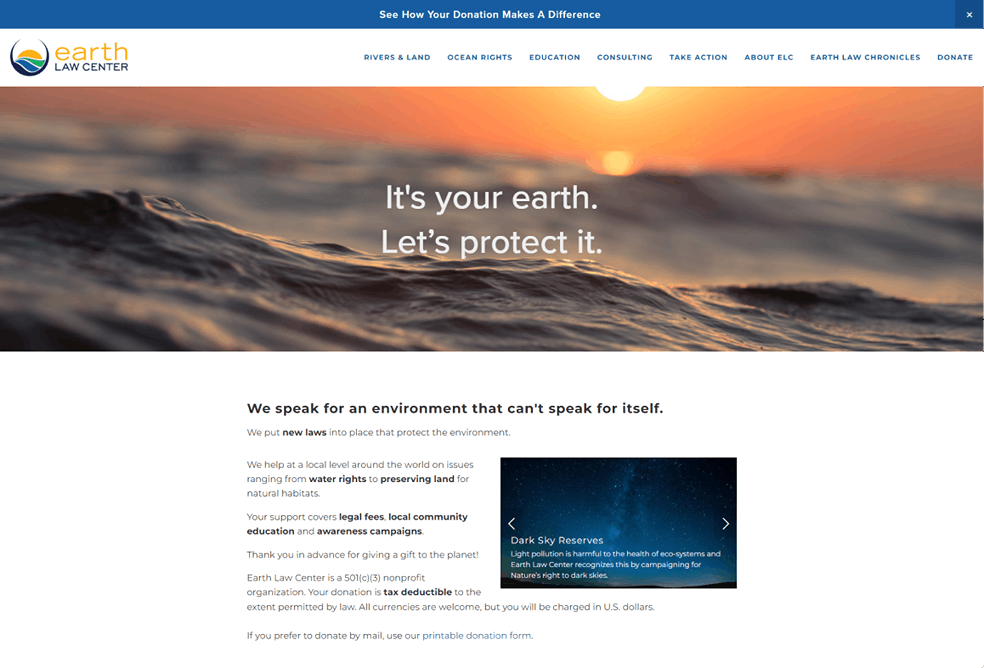
Earth Law Center was launching a Google ad campaign that would lead to the donation page so we decided to create a new donation page. The form had to stay the same but the content of the page surrounding the form could be updated.
I worked with a data analyst to understand the goals of the organization and KPIs of the new page. This gave me the opportunity to ask more questions about the project and gather more context.
Education, awareness, and community involvement were the organization’s highest priorities, even more important than gathering donations and raising money.
I worked from the base of the existing donation page which is linked from the CTA. This helped me stay within the organization’s brand guidelines and to keep the page coherent with the rest of the site. The form had to stay the same because there was no flexibility as it was administered via a third party.
The original page had an image below the hero that said “It’s yours to protect” and a small snippet of text to the left of it.

Design Thinking
To keep consistency across the pages, I kept the hero banner.
I did some reading to understand best practices for donation pages. According to this NNG article, users say they are looking for information about where the donation is going and its impact.
The organization has many diverse projects and causes so I wanted to emphasize some examples of their work. This also aligned with their goal of educating people and bringing awareness to environmental issues.
Within the limitations of the site, I thought the image slider was the best way to display information in such a small space. I didn’t want to overwhelm users by having too much text. Although there is a lot of research that points to how hero carousels are not a very user friendly component and to how they go untouched by users, I wanted to allow them the chance to peruse the information if they desired. The carousel also doesn’t move to the next slide automatically which should help prevent user frustration.
I borrowed some eye-catching images from across the site that would hopefully make the experience of reading the information more enjoyable. In doing so, I also tried to grab darker images so that there was enough contrast between the text and the image (as there was no overlay option) but if I were to go back and change it now, then I would add a black overlay to the bottom of the images themselves.
Later, I learned at an Adobe conference that hero carousels are not environmentally friendly and I am sure the same principles largely apply to the image slider. Knowing this now, I would probably remove the image slider in place of one image with some text embedded on the page over it.
On the left side of the page, in keeping with the idea that users want to know the mission of the organization and where their money goes, I added this information in small snippets. The first line gives a very simple overview of what the organization does and the second line that follows provides a bit more detail. The third line explicitly tells the user what the donations are going towards which are “legal fees, local community education, and awareness campaigns”.
I went through the content and bolded key words that would help users scan the information as per good instructional design. However, too many bolded words have the reverse effect of slowing users down and overwhelming them. With this in mind, I would probably opt to bold fewer words such as “new laws” and “tax deductible” if I were design this page now.
