School Zone Safety
- Design project
Overview
Goal: Create a landing page that brings attention to 3M’s commitment to pedestrian safety in a way that users can easily participate.
Process
3M Corporate reached out to my design and development team to ask us if we could create a landing page for their School Zone Safety Campaign. This project was unique as they wanted a page that was coherent with the rest of the 3M site but that still stood out by having its own characteristic styles.
I would also be working with McCann design to ensure that the designs were feasible within the limits of our technology, accessible, and coherent with 3M’s brand and voice guidelines.
McCann provided the initial layout, images, and content. I adjusted the design as needed, came up with alternative ideas for layouts that would not work, made improvements to the page’s accessibility, solely collaborated with developers to implement the page, conducted QA, and more.
Design Thinking
Accessibility
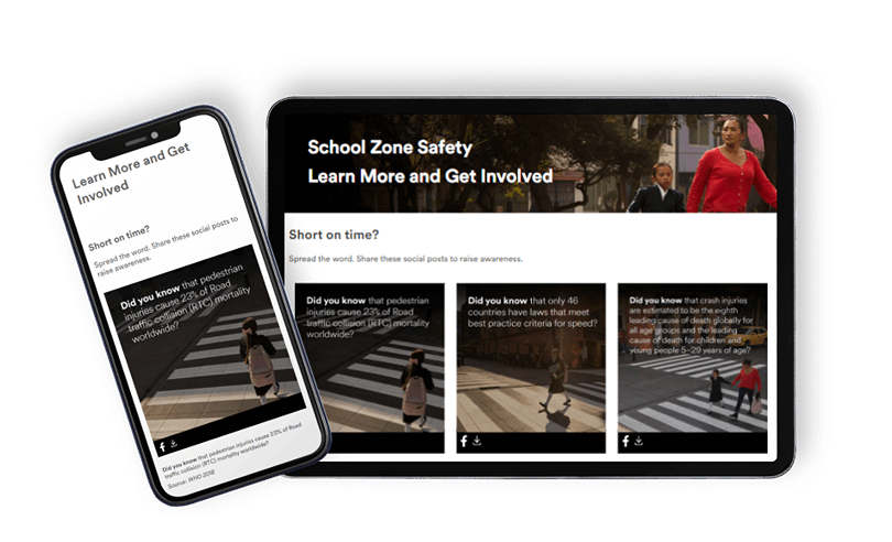
The initial designs included text on most of the images. I presented two alternatives to this in keeping with WCAG 2.0 – black boxes behind the text (as is consistent with the rest of the site) or adding dark gradients. We decided to mostly implement the dark gradients on the images. I provided responsive versions of these images to development so that the gradient extended below the text as needed and removed the gradient when the text moved below the image on mobile.
There was push back to adding the gradients and black boxes to all the images, so I recommended in those cases where the clearer images were wanted that we implement regular columns with text below the image. We implemented both the gradient and black background on the desktop banner image (as seen above).
We added a component to the page that allows users to share an image to raise School Zone Safety awareness. In this case, the text needed to be embedded in the images so I suggested adding snippets of text below the image with the source. I also added dark gradients to the images to ensure there was enough contrast between the image and the text.
I also ensured that we received alt text from the design agency and that it followed our internal guidelines.
Social Media Sharing Component
Corporate wanted the page to include a social media sharing component that would allow users to spread awareness. As we didn’t already have a standard component like this in our library, we had to make one. We found other pages on the 3M site that had their own custom social media sharing components in their own styles that we used as a foundation for the code and inspiration for the design of the page.
Within the limitations of what we were able to do, we found that users would only be able to share images directly to Facebook. In light of this, we added a download icon to emphasize to the user that they could share it to other platforms if desired.

Collaboration
Although I was collaborating with a design agency, we also had internal resources that I reached out to as needed.
These resources included an SEO team that I worked with to ensure that the page content was relevant and that the alt text was written in an up-to-date fashion. I also worked with the developers to ensure they had everything they needed to build the page and to conduct QA on it before publishing. I also worked with other designers in the company to get their feedback before presenting the updated design to corporate. The new design was also given to brand and tone of voice reviewers within the company.
