User Shopping Experience
- Research project
Overview
Goal: Find user insights for the client in order to improve the user experience on both of their retail sites.
When I was working at Venuiti Solutions, a client asked our team to create an Environmental Trend Analysis and UX Report for two of their large retail sites. I have kept information about the business confidential.
We combined the insights for both sites as they shared the same structure and purpose, the principle difference between the sites is that one is marketed towards higher income consumers and the other was family and budget oriented. Any insights that were specific to one site were called out separately in our presentation. I was primarily responsible for the market and user research.
For the purposes of this portfolio, I will only be focusing on the findings from the user research component. I used UserTesting.com to test the checkout experience and user flow of potential customers.

user interviews conducted.

Tested on desktop and mobile.
Process
I met with managers to gather context and understand the business goals. I explored the sites to collect questions and generate ideas. I continuously gathered insights and feedback from my team while creating the user tests.
I started with a few test runs on Usertesting.com before conducting all of them to ensure that any necessary improvements could be made. Once the tests were ready, I observed them while taking notes of quotes, physical behaviour, users’ emotions, ideas, and more.
I then organized the notes to find patterns and create visuals such as empathy maps.
I leaned towards a lot of open-ended questions as I wanted to find insights rather than project my own assumptions onto the findings.
User Pain Point: Finding the Checkout
After exploring the product details’ pages, users were asked to proceed to the checkout with a product of their choosing. We expected that this would be a smooth and easy process, and I thought users would simply select the checkout CTA on the product page. Instead, most users wanted to use the top navigation bar.
The checkout button was located in a standard location at the top right of the navigation, and it consisted of an icon of a truck with the title “My Truck” below it.
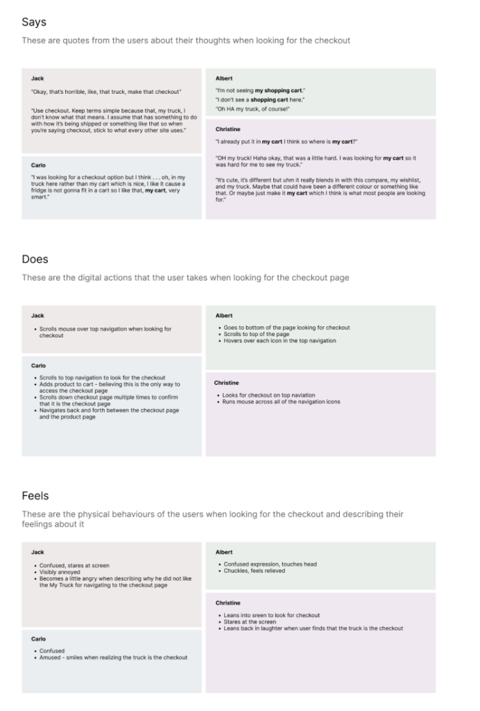
Most users experienced considerable difficulty identifying this icon as the checkout, and many users wasted minutes looking for it. This proved to be a great opportunity to create empathy maps to demonstrate this as a user paint point to the client – especially since the client really liked this icon.
The empathy maps below outline the quotes, digital actions, physical actions, and feelings of 4 users when attempting to find the checkout in the navigation which we used to present the problem to the client. Users’ names were replaced with fake names.

Presenting to the Client
A common trend noted here was that users explicitly mentioned looking for “My cart” over “My truck”.
While one user was outwardly angry about the icon, most users laughed in relief when they eventually found it. Some users even complimented it. This does not take away from the negative experience but rather, we were able to leverage these “positive” reactions with the negative reactions when presenting these findings to the client.
Some of the most concerning user pain points from this experience include:
• Minutes wasted looking for the icon
• One user spent 10 minutes looking for the checkout
• User frustration and confusion
• Physical discomfort
• Users straining/squinting their eyes to look harder
• Users leaning in and moving their bodies to look closer at the screen
At no other point in the journey did users spend so much time and exert so much physical and mental effort to complete a task. We also provided snippets of these videos to the client to emphasize the problem.
A Snippet of User Interview Findings
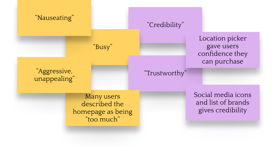
- Users were overwhelmed by the homepage
- The hero carousel was moving too fast, users described it as “nauseating”
- As a result, they also couldn’t read the information on the banners
- Pop-ups annoyed or enraged most users
- Even when users did not verbally comment on the pop-ups, they still showed annoyance and/or confusion
- This presented a problem as users also felt the information did not appear at relevant moments and one user even confused the pop-up with the checkout process

When presenting the results to the client for improvements, we knew that some of this information might not be agreeable to them. For example, pop-ups were a feature that they insisted on keeping even after multiple discussions about how it is not providing the best user experience. I provided two solutions to balance this negative feedback for the client.
1. We presented them with the positive feedback provided about the homepages at the same time.
2. We suggested improvements that could be made to the pop-ups based on the user feedback rather than focusing on having them removed altogether.
Suggestions were given to the client about making pop-ups appear at more relevant moments. For example, a pop-up providing the user with a digital catalogue link ended up confusing or angering users when appearing at checkout, this one would be more useful to users at an earlier point in the user flow. Users also did not appreciate pop-ups appearing immediately as they entered the site. Many commented that they would have preferred to see the site more before committing to anything or providing any information.
Most of the users hated the hero carousels. There is a lot of research and content available about why hero carousels provide a poor experience. I was easily able to reference this material to support our findings.
We also proposed to the client that clear headings be added to the product pages as it might help users scan large bodies of product information more efficiently.
Final Results
I consider this project to be a success for the following reasons:
• I discovered and presented multiple user pain points to the client
• I conveyed a significant user pain point to the client using empathy maps
• I worked with my team to address the user pain points, such as changing “My truck” to “My cart”
Next steps would have included validating these updates through further user interviews and collaborating with the client to encourage more user friendly updates while taking business goals into account.
